Christian Book Cover Design: What Makes Readers Click “Buy”
Readers really do judge your book by its cover — in about half a second, as a thumbnail the size of a postage stamp. For a Christian book, a great cover does something harder than look pretty: it signals the genre, earns trust, and never overpromises. Here's how to get one right.
The only test that matters first: the thumbnail
Wherever your book sells — Amazon, a church bookstore, an Instagram post — it is first seen as a tiny thumbnail next to dozens of others. So before anything else, ask: does it work at the size of a thumbnail? Shrink your design to ~150 pixels wide and look. Can you read the title? Is there one clear focal point? Does it feel like the *kind* of book it is? Most covers fail here — too many elements, a title too small, an image that turns to mud. Win the thumbnail and you've won the click.
Signal the genre — covers are a promise
A cover is a contract with the reader about what's inside. A grief devotional, a bold leadership book, a dramatic testimony, and a gentle children's Bible storybook should look like four different worlds — because they are. Browse the Amazon bestsellers in *your* specific sub-category and notice the visual language they share: the color moods, the type styles, the imagery. You're not copying — you're learning the genre's “dialect” so your cover reads as “a book like the ones I already love,” then differentiating within it.
Typography carries more than the image
On most strong covers, the type does the heavy lifting, not the picture. A few fundamentals:
- Legibility beats style. A beautiful font you can't read at thumbnail size is a failed font.
- Hierarchy. The eye should land on the title first, then the subtitle, then your name — in deliberate order, not a jumble of equal-weight text.
- Two fonts, maybe three. A serif for warmth or a clean sans for clarity, paired with one accent. More than that looks amateur.
- Let it breathe. Generous space around the title reads as confidence; a crammed cover reads as a flyer.
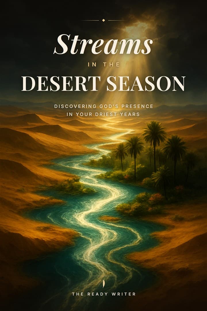
Imagery and symbolism — restraint reads as faith, not kitsch
Christian covers live or die on restraint. A single, well-chosen image or symbol — light through a window, an open road, a single object that carries the book's metaphor — almost always beats a literal collage of crosses, doves, and clouds. Aim for the feeling of the book, not an illustration of its title. And avoid the tired clichés that make a cover look self-published in the worst sense: glowing sunbeams behind a silhouette, stock-photo praying hands, a rainbow gradient with a swirly script font. Evocative beats obvious.
Your three paths to a finished cover
However you get there, the goal is the same: a cover that passes the thumbnail test and signals your genre.
- Hire a designer. The most polished result, typically a few hundred dollars and up. Give them comp titles and a clear brief — the better your brief, the better the cover.
- DIY (Canva, KDP Cover Creator). Cheapest and fastest, but easy to land in cliché territory. Lean on a genre-appropriate template and keep it simple.
- AI-assisted, art-directed to your book. The newer middle path: concepts generated from your book's actual themes, which you refine and own. The Ready Writer's cover studio works this way — it reads your blueprint and proposes concepts grounded in what your book is really about, so the art isn't generic.
Get the KDP specs right (or the upload bounces)
Amazon is exacting about cover files. For the paperback, the cover is a single wraparound (back + spine + front), and the spine width depends on your page count — use KDP's cover calculator so the spine text lands centered, not creeping onto the front. Build at 300 DPI, include the required bleed, and keep title text away from the trim edges. For the eBook, you only need the front cover (commonly ~1600×2560 px). Then — the step almost everyone skips — order a printed proof and look at it in your hands before you publish; screen colors and paper colors are not the same.
Where the cover fits in the bigger picture
The cover is one piece of getting your book into the world. For the rest — formatting, description, keywords, and launch — see how to self-publish a Christian book on Amazon KDP, and for the whole journey from message to manuscript, our complete guide to writing a Christian book. The Ready Writer's Publishing Suite includes the cover studio plus the full KDP package — see what's included.